A brand identity is the set of things people can see or hear and link straight back to you: a logo, a colour, a typeface, a way of writing, sometimes a shape or a sound. It works when somebody meets one of those things with your name taken off and still knows whose it is. Most guides to building one describe the parts and stop there, which is why so many finished identities look professional and still fail to register.
The eight steps below build the identity around that recognition test instead. You will end up with fewer assets than a full brand manual asks for, each one chosen because you can repeat it everywhere without help, plus a one-page document you can hand to a printer, a freelancer or a new colleague. Everything here is possible with free software, and where something costs money the price is named.
Prices are quoted in the currency each company publishes, which means US dollars for Canva and euros for Soofos.
What is a brand identity, and how is it different from a brand?
A brand identity is the part you control and repeat. A brand is what people already think about you, built out of everything they have seen, heard and experienced, and you only influence it.
That distinction matters because it tells you what the work is for. You are not trying to install a feeling in somebody’s head. You are trying to make a small number of signals so consistent that they get attached to your name through repetition, so that the next time one of them appears the reader knows who is talking before they read a word.
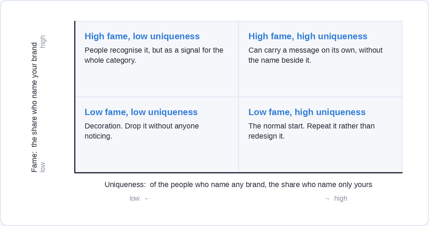
Jenni Romaniuk’s Building Distinctive Brand Assets (Oxford University Press, 2018) gives the two measures this depends on, and they are worth having in mind from the first sketch. Fame is the share of your audience who correctly name your brand when shown the asset on its own. Uniqueness is the share of the people who name any brand at all who name only yours. An asset needs both. A colour that half your market links to you is useless if they link it to two of your competitors as well.
What does a brand identity include?
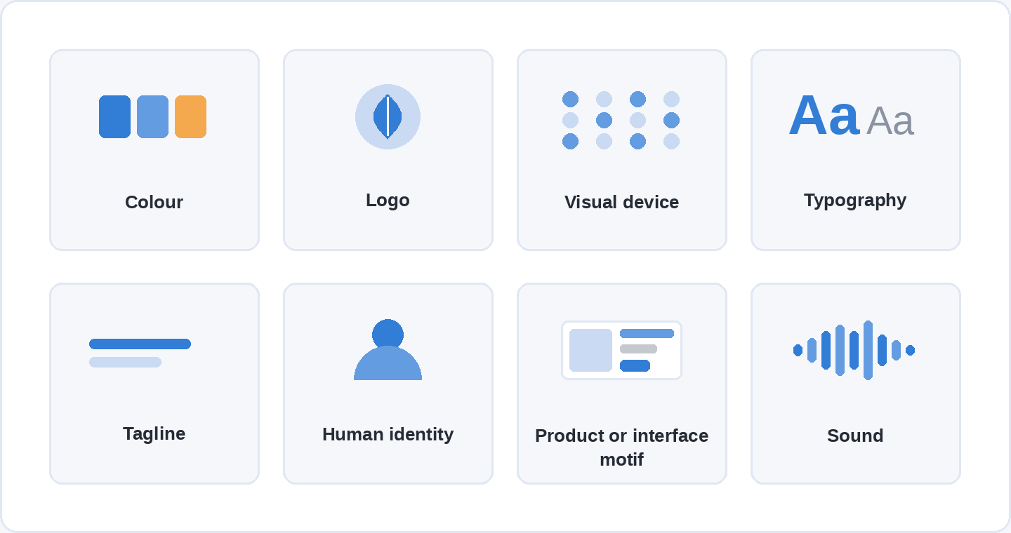
A brand identity is usually built from eight kinds of asset: colour, the logo, a visual device such as a shape or pattern, typography, a tagline, a human identity such as a founder or a character, a product or interface motif, and sound.
Nobody needs all eight. A recent audit of brand distinctiveness gives a sense of how thinly most of them are used in practice: Louis Grenier’s State of B2B Brand Distinctiveness (STFO, published 10 June 2026) scored 100 B2B software and AI companies on all eight asset types, marking each from 0 (absent) to 3 (recognisable out of context). Colour came out strongest at an average of 2.12 out of 3. Sound was effectively unused, with 91 of the 100 companies scoring zero. Human identity averaged 0.73. Seventy-eight of the hundred landed in the band the audit calls generic, and one company reached the top band.
Two things to keep in mind about those numbers. The scores are a reviewer’s judgement of each asset, hand-checked after an AI-assisted first pass, rather than measured recognition among real buyers, so they say how distinctive the assets look to an expert rather than how famous they are. And the sample is B2B software, which is one of the most visually convergent categories there is. Read them as evidence that most organisations own nothing in particular, not as a benchmark for your own trade.
Step 1: Write the brief before you draw anything
Start with one page that says who the identity is for and what it has to do, because every later decision gets settled by arguing against it.
Four things belong on that page. Who you are for, described specifically enough to exclude people. What they are choosing between when they find you, which is usually two or three named alternatives and sometimes doing nothing at all. What you do for them, in one sentence a stranger could repeat. And how you want to come across, in three words you are willing to be held to.
The third of those is the hard one, and it is worth writing badly and then fixing. “We help small clinics keep their appointment books full” survives being read aloud to a stranger. “We deliver patient-centred growth solutions” does not survive being read aloud at all.
Keep the three words honest rather than flattering. Warm, plain and quick is a usable brief. Premium, innovative and trusted describes almost every organisation that has ever written a brief, so it cannot guide a single decision about a colour or a typeface.

Step 2: Choose the three or four assets you can repeat
Pick assets by asking where they will appear, not by asking which look best in the presentation.
An asset earns its place when you can apply it without a designer, on every surface you actually use, for years. A colour qualifies almost always. A typeface qualifies if it is installed or freely available everywhere you publish. A pattern or shape qualifies if you can crop it, tile it and print it in one colour. A photographic style qualifies only if somebody will keep shooting or licensing to it, which in a small organisation is usually nobody.
Sound and characters are the assets with the most room in them, on the evidence above, and also the ones that need the most repetition before anyone links them to you. If you are choosing three to start with, colour, typography and the logo are the combination that does the most work for the least upkeep, because they appear together on everything you publish.
The grid below is how Romaniuk’s two measures get used in practice. An asset with high fame and high uniqueness can carry a message on its own, which is how a colour ends up recognisable without a name beside it. High uniqueness and low fame is the normal starting position for something new and the only thing wrong with it is that not enough people have seen it yet, so it needs repetition rather than redesign. High fame and low uniqueness is the trap: people recognise the thing, but as a signal for your whole category. Low on both means the asset is decoration and can be dropped without anyone noticing.
Step 3: Choose colours for distinctiveness, then check they can be read
Choose your main colour by finding out what your competitors already own, then taking something else.
Open the websites of the five organisations a customer would consider alongside you and write down their primary colours. In most trades you will find the same two or three hues, and the gap in that list is worth more than any theory about what a colour means. This is the practical version of the uniqueness test, and it takes about twenty minutes.
While you are there, a claim to ignore. “Colour increases brand recognition by 80%” appears in a large share of the branding advice on the internet, usually credited to a study at Loyola University. Researchers who went looking for it found that the two papers by Ellen Hoadley it points to, from 1990 and 2000, are about how colour in graphs and text affects the way people process information, and that neither of them contains the sentence. The figure appears to come from a Xerox marketing leaflet called 20 Ways to Share the Color Knowledge, which is not a research finding about brand recognition at all.
What colour does do has been measured. Labrecque and Milne, in the Journal of the Academy of Marketing Science (2012, volume 40, pages 711 to 727), ran four studies on colour and brand perception and found that hue shifts which personality traits people attribute to a brand, with red read as exciting and blue as competent, and that saturation and brightness change the strength of those readings. That is a real effect and it is also a small one next to consistency. Use it to break a tie between two workable palettes, not to pick the palette.
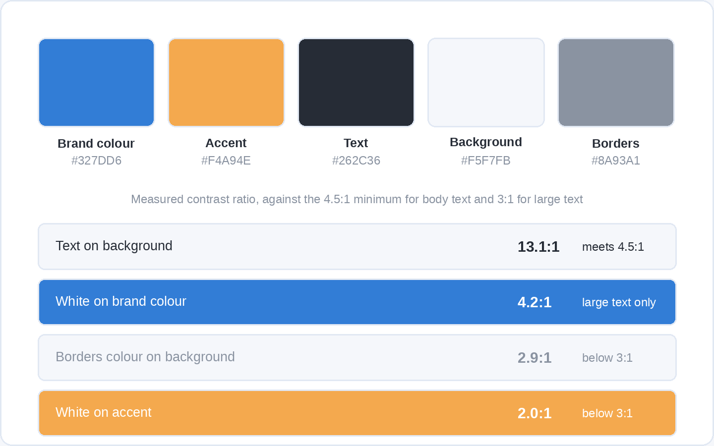
Then build the palette properly. You need one brand colour, one accent used sparingly, and three neutrals: a dark for text, a light for backgrounds, and a mid grey for borders and secondary text. Five values, written down as hex codes, is enough to lay out anything.
The check that gets skipped is contrast, and it is the one that has a number attached. The Web Content Accessibility Guidelines set a minimum contrast ratio of 4.5:1 between text and its background at level AA, dropping to 3:1 for large text, which the guidelines define as at least 18 point, or 14 point when bold. Interface components and the parts of a graphic you need in order to understand it have their own 3:1 minimum.
The figure below runs those checks on this blog’s own palette, with each ratio calculated rather than eyeballed, and only one of the four pairs clears the minimum for body text. Dark text on the light background clears the body-text minimum nearly three times over at 13.1:1. White on the brand blue reaches 4.2:1, which passes for large text and for buttons and fails for body copy. White on the amber accent manages 2.0:1, which is why the accent belongs on small highlights rather than on anything a reader has to get through. The border grey against the background sits at 2.9:1, just under the 3:1 minimum for non-text elements, so it wants darkening. Run every pair you intend to use through a free contrast checker before the palette is final, because discovering later that your brand colour cannot hold white text rewrites every button you own.
Step 4: Choose two typefaces you are allowed to use
Choose one typeface for headings and one for body text, and check the licence before you fall in love with either.
Two is enough, and one is often better. What matters more than the pairing is that the body typeface is comfortable at small sizes on a screen and that both are available everywhere you publish, including in a colleague’s email client and in whatever template your invoicing software uses.
Licensing is where this goes wrong quietly. Most of the families on Google Fonts are released under the SIL Open Font License version 1.1, some under Apache 2.0, and the Ubuntu fonts under the Ubuntu Font License, and each family directory carries its own licence file, so the advice from Google’s own repository is to read the licence for every font you use. The Open Font License is generous: fonts under it can be used in books, posters, artwork, logos and on websites with no acknowledgement required, and can be modified and redistributed. A commercial licence bought from a foundry often works differently, with separate terms for web use, for app embedding and for use in a trademark, which is exactly the use a logo puts it to.
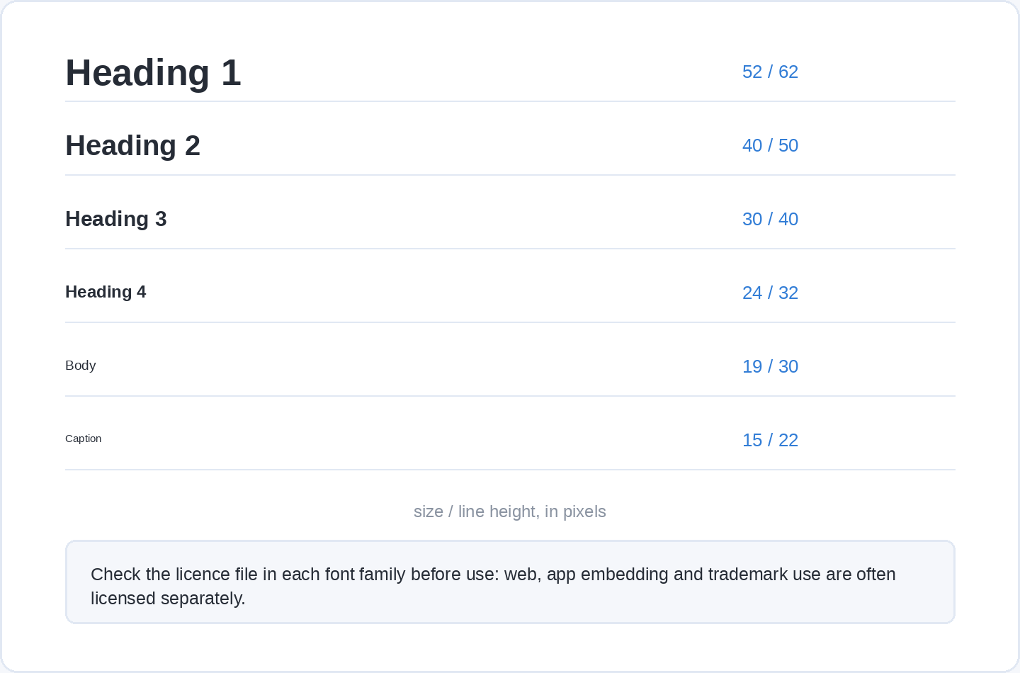
Decide your sizes at the same time. A heading scale of four steps, one body size, one small size for captions and labels, and a line height for each is the whole typographic system most organisations ever need.
Step 5: Draw the logo, then draw the versions you will actually use
Design the logo last among the visual decisions, because it has to work in the colours and typeface you have already chosen.
The logo is one asset out of several and it absorbs most of the attention anyway, so it helps to treat it as a production job with a spec. We have a full walkthrough of the drawing part in how to design a logo people remember, including the small-size and one-colour tests, so this step is only about what a brand identity needs on top of a single finished mark.
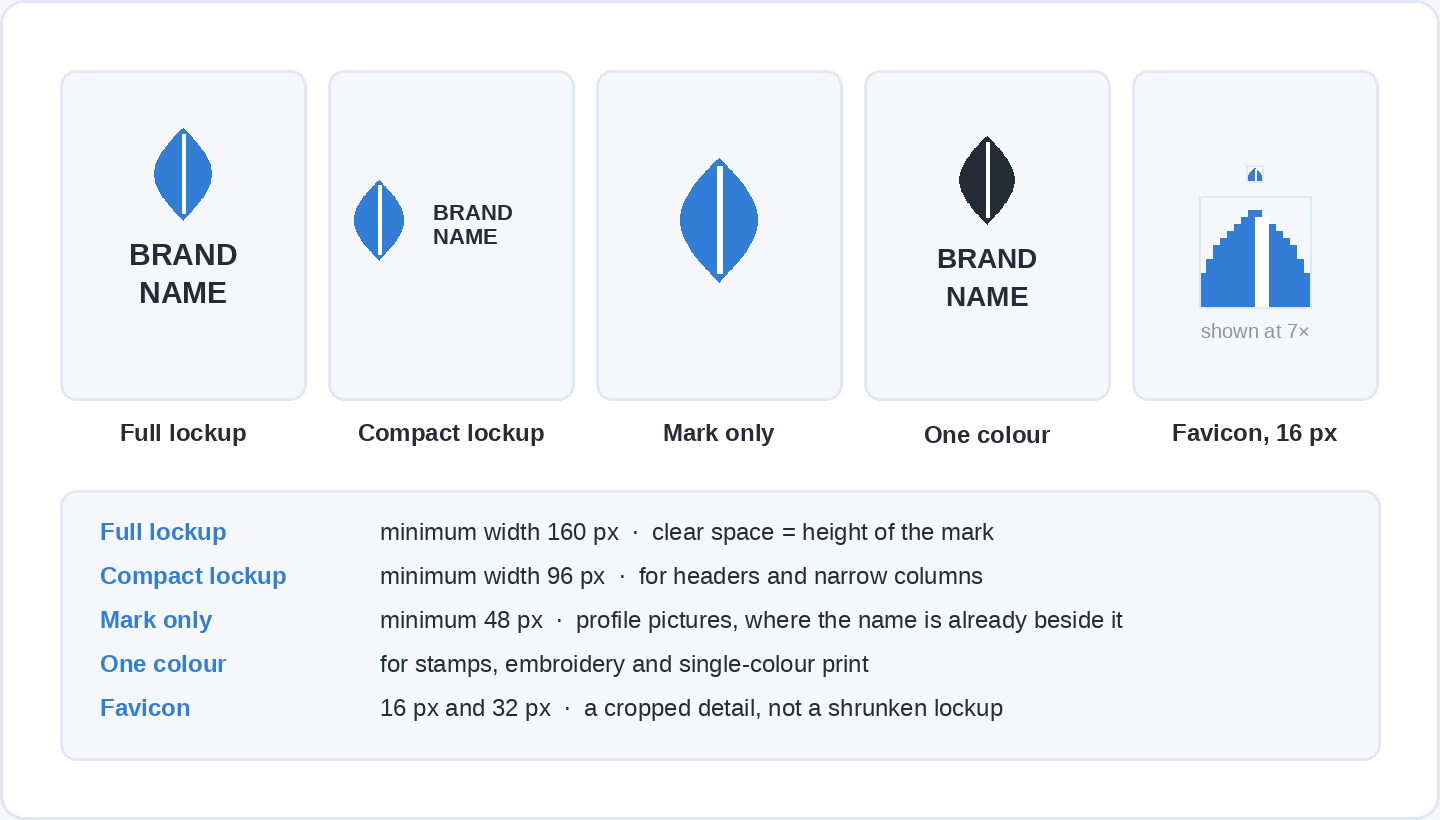
You need a set, not a file. A full lockup with the name for websites and letterheads. A compact version for narrow spaces. The mark on its own for a profile picture, where the name is already written beside it. A one-colour version for a stamp, an embroidered shirt or a fax-quality scan. And a favicon that survives 16 pixels, which usually means a cropped detail rather than a shrunken lockup. Export each one as SVG and as PNG, and write down the minimum size and the clear space for each.
Step 6: Write down how the brand talks
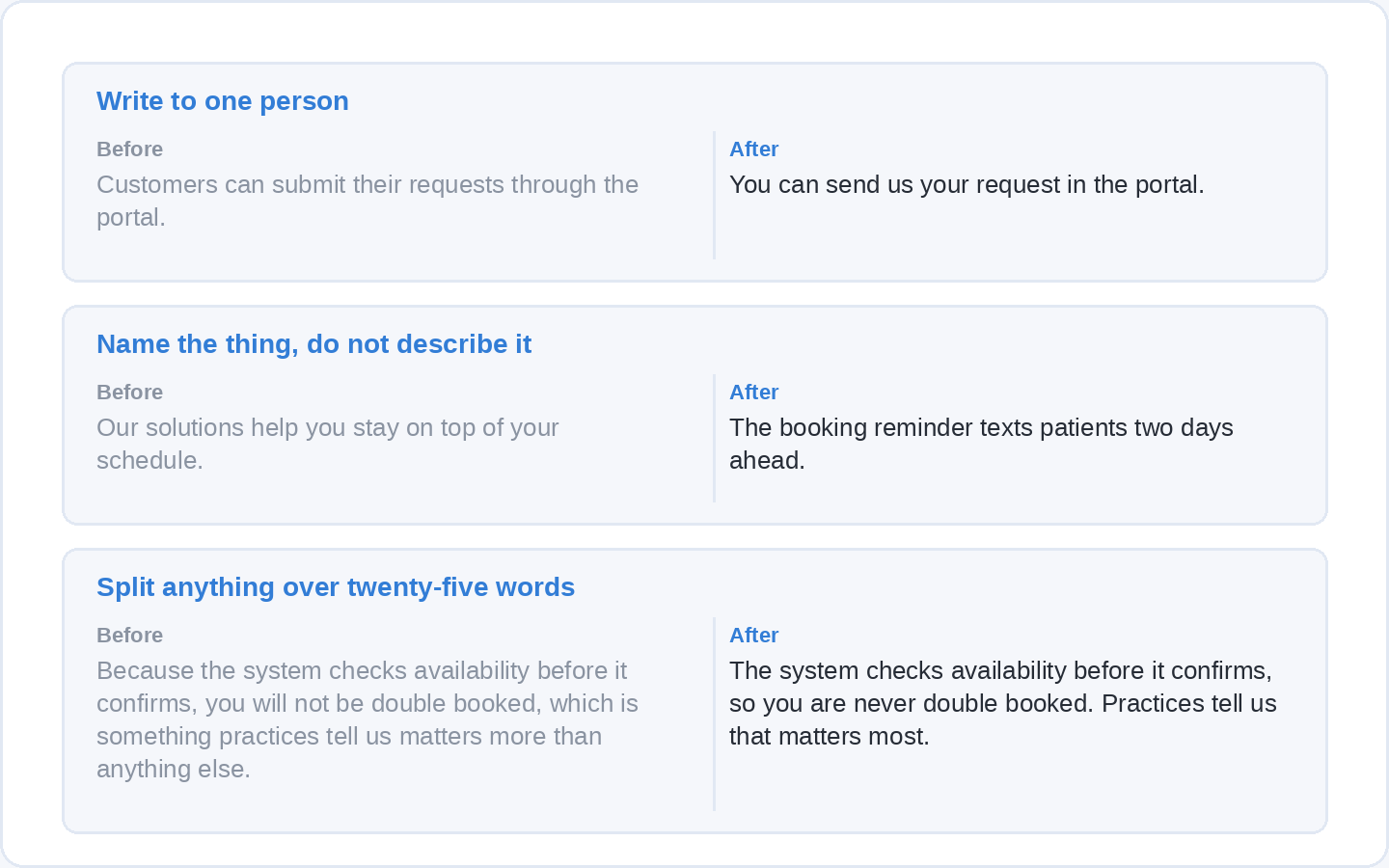
Write three or four rules about language, each with a before and after, because that is the only form of voice guidance anyone applies.
Adjectives do not survive contact with a real sentence. “Friendly and professional” tells a writer nothing they can act on, while “we say you, not our customers” changes the next paragraph they write. Look at anything you have already published, find the habits you want to keep and the ones you want gone, and write the rules as pairs.
Rules worth considering: which person you write in, whether you contract words, how long a sentence gets before it splits, what you call the thing you sell, and which three words you never use. Add the words your industry uses that your customers do not, with the plain replacement beside each.
Soofos’s own pages are a reasonable example of what this looks like when it is done. They name specific things instead of describing them, as in “the maths teacher who finally made it click”, and they say what you get in concrete terms, as in “bite-sized lessons, your own pace, on any device”. Neither of those is a style rule you could guess from the words friendly and professional.
Step 7: Put the whole thing on one page
Put the rules on a single page, because a sixty-page brand manual is a document nobody opens twice.
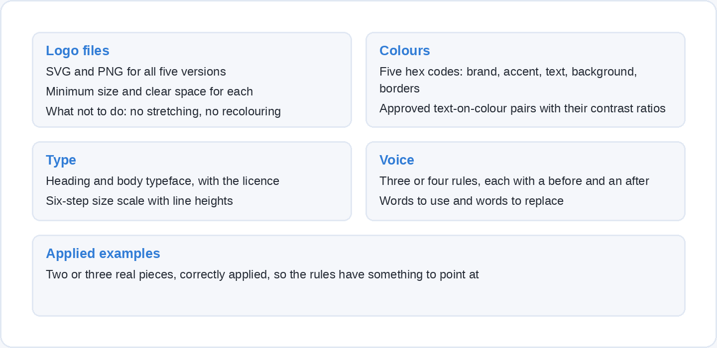
One page holds more than you would think: the logo files with their minimum sizes and clear space, the five hex codes with the approved text-on-colour combinations, the two typefaces with the size scale, the three or four voice rules, and two or three examples of the identity applied correctly. Anything else is reference material and can live in a folder behind it.
If you work in Canva, its free plan includes one brand kit limited to three colours, which is enough for a brand colour and two neutrals; the Pro plan is US$144 a year for one person and raises that to five kits, and the Business plan is US$250 a year per person. A shared folder with the files, a PDF of the page and a plain-text version of the colour codes does the same job for nothing.
Step 8: Apply it, then audit it with the name covered
Apply the identity to every surface you own, then test it by removing your name and asking somebody whether they can tell it is you.
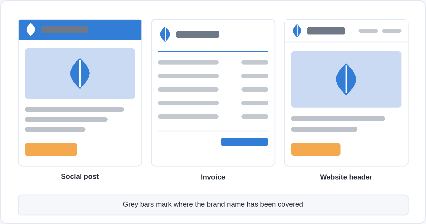
Cover the name on three things you have published recently, ideally a social post, an invoice or email, and a page of your website. Show them to somebody outside your organisation and ask two questions: whose is this, and could it be anybody else’s. The first question is fame and the second is uniqueness, on a sample of one, and ten people asked over an afternoon is enough to show you which of the two is missing.
Fix whatever the test exposes, and expect it to be consistency rather than design. The commonly quoted claim here is that consistent branding increases revenue by 33%, from a 2019 Lucidpress study. Worth knowing what it rests on: the announcement says the figure came from a survey of more than 200 organisations and does not say whether the revenue effect was measured or estimated by the respondents themselves, so treat it as an industry survey rather than as a measured return. The argument for consistency does not need it. Every inconsistent application is a repetition your assets did not get, and repetition is the only mechanism by which any of this starts working.
Put a date in the calendar a year out to run the same test again. Identities drift because individual decisions are each reasonable, a second blue here, a different typeface in a slide deck there, and nobody notices until the set no longer looks like a set.
How long does it take, and what does it cost?
A first workable identity takes a few focused days if you are doing it yourself, and the software can cost nothing.
The time goes mostly into step 1 and step 5. Writing the brief is a day of thinking that feels like no work at all, and the logo set is where the fiddly hours are. Colour, typography and the voice rules are an afternoon each once the brief is settled.
For tools, free covers it: a vector editor for the logo, a browser-based design tool for layouts and templates, a contrast checker, and an open-licence typeface pair. Paying a designer buys judgement and speed rather than a different list of assets, and if you do commission one, the brief from step 1 is the thing that makes the money worth spending. We have a broader introduction to what design decisions involve in what is graphic design, and a walkthrough of the browser-based option in what is Canva.
Questions people ask about brand identity
What is the difference between a brand identity and a logo?
The logo is one asset inside the identity. A brand identity also covers colour, typography, language and any shape, character or sound you repeat, and in practice the colour and typeface appear more often than the logo does.
How many colours should a brand identity have?
Five values are enough for most organisations: one brand colour, one accent used sparingly, a dark for text, a light for backgrounds and a mid grey for borders. More than that and applications start to disagree with each other.
Can I create a brand identity without a designer?
Yes, and the constraint is judgement rather than software. Free tools cover every step here. What a designer adds is faster elimination of the options that will not survive a 16-pixel favicon or a one-colour print.
How do I know whether my brand identity is working?
Cover your name on three recent pieces and ask people outside your organisation whose they are and whether they could be anybody else’s. Those two answers correspond to the fame and uniqueness measures the research uses, and they are the only outcome the identity is responsible for.
Do I need a tagline and a sound as well?
No. Both are legitimate assets and both need a great deal of repetition before anybody links them to you, which is why sound is almost unused even among well-funded companies. Colour, typography and the logo are the combination to get right first.
How often should a brand identity be changed?
Rarely, because every change resets the repetition that makes the assets recognisable. Audit annually, fix inconsistencies and small technical problems, and treat a redesign as something you do when the business itself has changed rather than on a schedule.
Where to take this next
The part of a brand identity nobody can shortcut is the judgement about which options will survive real use, and that comes from seeing enough design work up close. If you want to build that up, a Soofos Plus membership is €19 a month for all 600+ courses across 13 categories, taught by people who do the work rather than presenters reading a script, with certificates included and cancellation in two clicks. Start with whichever course covers the tool you have decided to use, then come back to your brief and see how much of it you would now write differently.