Ask 85 university students to draw the Apple logo from memory and exactly one of them gets it right. Adam Blake, Meenely Nazarian and Alan Castel ran that study at UCLA and published it in the Quarterly Journal of Experimental Psychology in 2015. When the same students were shown the real logo next to near-identical fakes, fewer than half picked the correct one, and a majority of the group were Apple users looking at a mark they saw every day.
That tells you what to aim at. What a good logo buys you is recognition rather than recall: a person glances at a browser tab, a delivery van or a 16-pixel favicon and knows whose it is before they have consciously looked at it. Designing for that is a practical problem with hard limits, and it is why the seven steps below run the difficult tests early rather than saving them for a tidy final section.
You can work through this in an afternoon for something simple, or spread it over a week if you want to sketch properly. Either way the order matters more than the hours.
What makes a logo memorable?
A memorable logo is a simple, distinctive shape that stays readable when it is shrunk and stripped of colour. Those three qualities carry almost all of the load, and each of them is testable, which is what makes them useful.
Simple means few parts. A mark built from two or three elements can be taken in at a glance, while a detailed illustration needs a second look that most people never give it. Detail is also the first casualty of small sizes, so complexity costs you twice.
Distinctive means it does not resemble the other marks in its own field. Every accounting firm with a blue shield is competing for the same slot in a reader’s head, and the reader files all of them under “an accountant” without separating one from another. Look at ten competitors before you look at ten award winners.
Whether the shape should say what you do is a genuine question with some evidence behind it. Jonathan Luffarelli, Mudra Mukesh and Ammara Mahmood studied 597 brands for the Journal of Marketing Research in 2019 and found that descriptive logos, meaning ones whose design tells you what the product is, were linked to more favourable brand evaluations than non-descriptive ones. The exception they found is worth knowing, because it flips the advice: when the product itself carries unpleasant associations, a descriptive mark works against the brand, which is why a cleaning service gains from looking like cleaning and a funeral director gains from not looking like funerals.
Step 1: Write down where the logo has to work
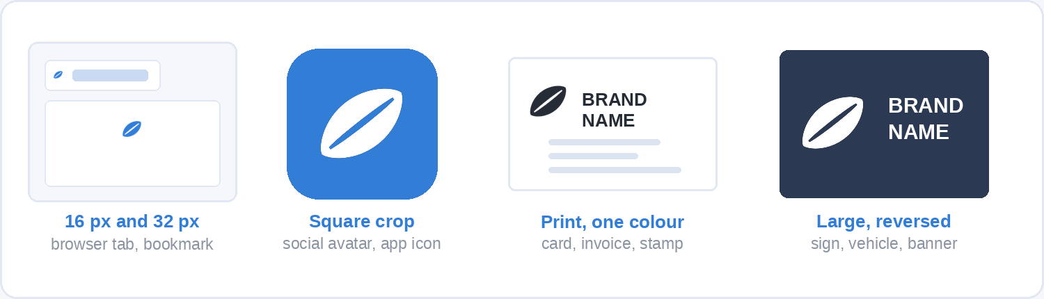
Before any drawing, list every place the finished logo will appear and how big it will be in each one. This is the brief, and it is five minutes of work that will save you a redraw.
A typical list for a small business runs something like this: a website header, a browser favicon at 16 or 32 pixels, a social profile picture cropped into a circle, an email signature, an invoice, a business card, and possibly a printed shirt or a vehicle. Roughly half of all page views worldwide now happen on a phone (StatCounter put mobile at 49.36% of global traffic in August 2026), so the small end of that list is the normal case rather than the edge case.
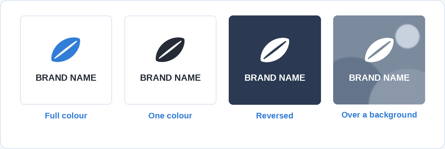
Two constraints fall out of the list immediately. The mark needs a version that works inside a square, because social platforms and app icons will crop it into one. And it needs a version with no colour, because embroidery, engraving, a fax to a supplier and a single-colour print run all exist.
Step 2: Pick the kind of logo you are making
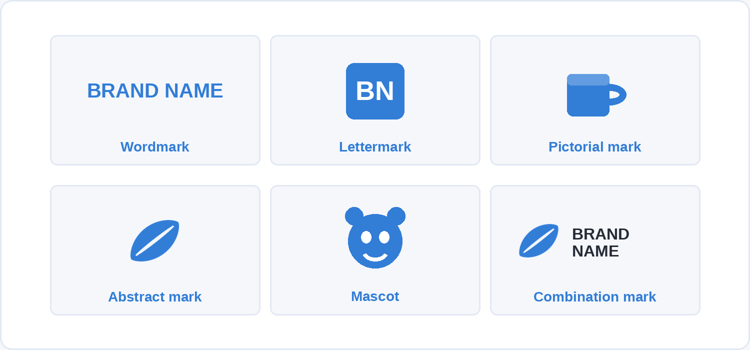
There are six common logo types, and choosing one before you sketch narrows the problem from “draw anything” to “draw one of these”.
A wordmark is the name set in type and adjusted, as with most fashion houses. It needs a name that is short and reasonably distinctive, and in exchange it is the cheapest route to something that reads at every size. A lettermark reduces the name to its initials, which is how long institutional names survive on a small screen. A pictorial mark is a recognisable object drawn simply. An abstract mark is a shape with no literal meaning, which gives you freedom but asks the audience to learn it from scratch. A mascot is a character, which works for a brand with a friendly, public-facing voice and dates faster than the others. A combination mark pairs a symbol with the name, and it is the safest default for a new business because the two halves can be used separately once the symbol is known.
If you are starting out with an unknown name, a combination mark is usually the right answer. The symbol gives you something ownable for the square crop, and the name does the explaining until the symbol can do it alone.
Step 3: Sketch badly, and sketch a lot
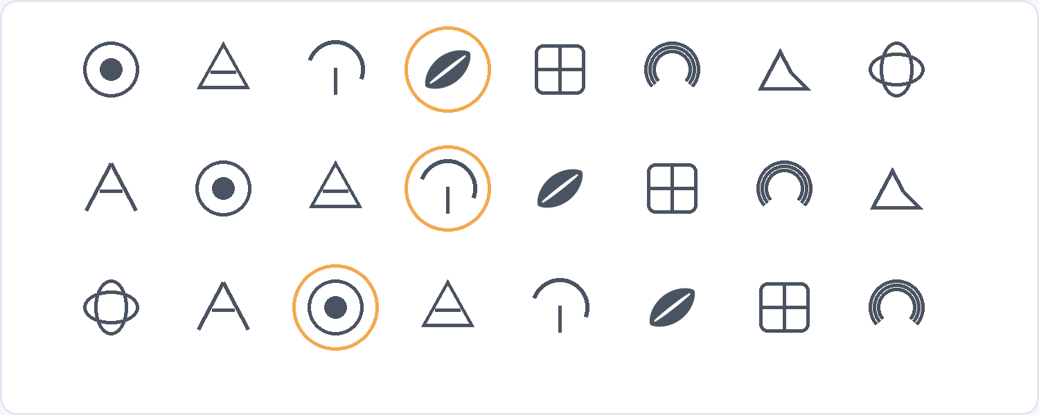
Fill a page with 20 to 30 rough thumbnails in pencil or black pen before you open any software. Keep each one under a minute and keep them small, about the size of a postage stamp.
The size is the point. A thumbnail forces you to draw the idea rather than the rendering, and a shape that fails at 2 cm on paper will fail at 16 pixels on a screen. Working in black also stops you from hiding a weak shape behind a gradient, which is the single easiest mistake to make once a computer is involved.
Expect most of them to be bad. The first five will be the obvious ideas that your competitors have already had, which is exactly why you want them out of your head and onto paper early. Circle three or four that still look interesting after a break, and take only those to the next step.
Step 4: Rebuild the best sketch as vector
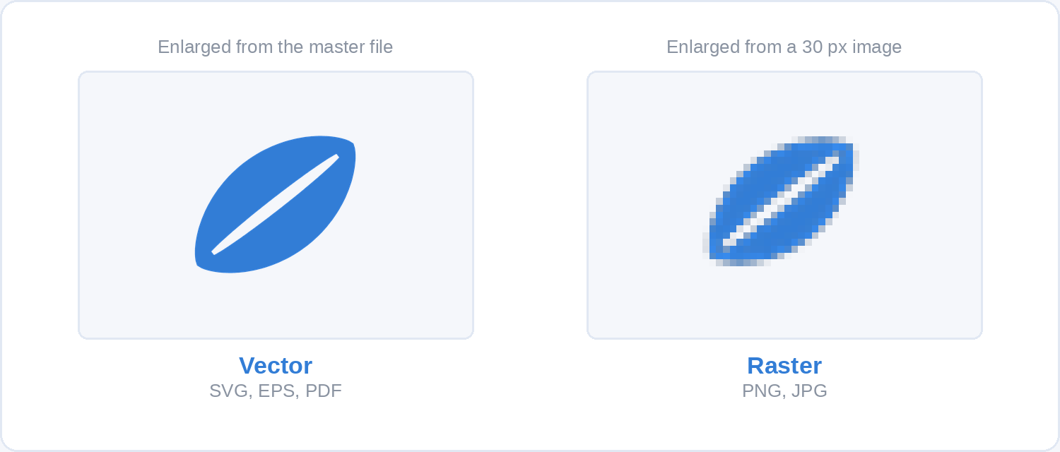
Redraw your chosen thumbnail as a vector file, not as a painted image. Vector artwork stores the mark as mathematical curves, so it stays sharp at any size, from a favicon to a building sign. A raster image stores it as a fixed grid of pixels and falls apart when you enlarge it.
This is a real distinction rather than a technicality, and it decides which software you need.
Four tools will do the job at no cost. Inkscape is free and open source, runs on Windows, macOS and Linux, and has everything a logo needs. Affinity has been free since Canva relaunched it in October 2025, combining vector, photo and layout work in one application for Mac and Windows with an iPad version announced. Figma has a free tier and works in a browser, which suits anyone already designing interfaces. Canva’s free plan handles a simple wordmark or a combination mark built from existing shapes, though it gives you less control over curves than the other three; our walkthrough of what Canva can and cannot do covers where that line sits.
Draw with as few anchor points as the shape allows, align things to a grid, and keep any curves consistent. If you find yourself adding a fifth colour or a third gradient, go back to the thumbnail.
Step 5: Run the three tests that decide it
Three tests will tell you whether the mark works, and all three can be run in about ten minutes. Most logo guides put them last. Run them as soon as you have a first vector draft, because the answers should change the drawing.
The small test. Export the mark at 32 pixels wide and look at it on a screen at actual size. Anything that turns into a smudge has to go: thin lines, small gaps, fine text inside a symbol, and any detail you would need to lean in to see.
The one-colour test. Fill the whole mark with flat black on white, then flip it to white on black. If the shape only holds together because two of its parts were different colours, it will fail on an embroidered shirt, an engraved pen, a stamp and a newspaper. This test catches more problems than any other single check.
The blur test. Blur the mark heavily, or step back three metres from the screen, and see whether the silhouette is still identifiable. What survives a blur is what a person actually processes in the fraction of a second they give your logo, and it is a fair proxy for recognition at a distance.
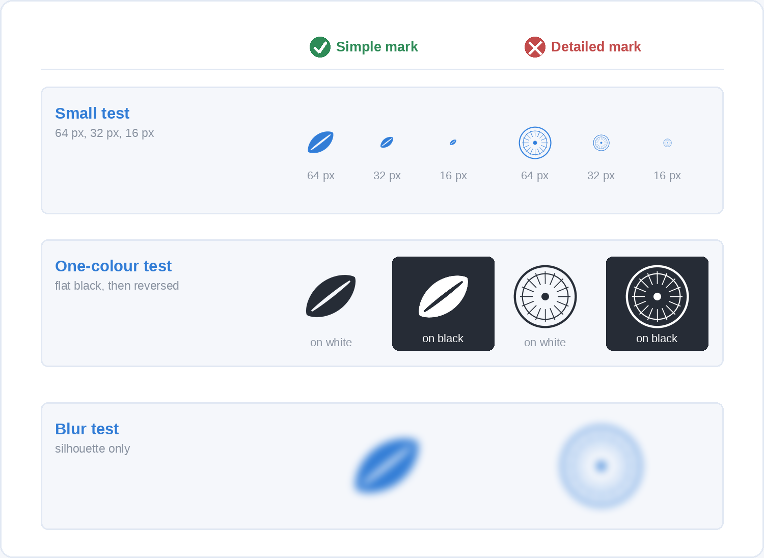
A mark that fails any of the three is not finished. Simplify it, usually by removing a part rather than by making the parts thicker, and run them again.
Step 6: Add type and colour last
Choose the typeface and the palette after the shape works in black, because a logo that depends on its colours is a fragile logo. Colour is not what people use to tell brands apart at small sizes; shape is, and colour is the confirmation that arrives a moment later.
For the name, pick one typeface and use one weight. Set it properly: adjust the letter spacing by eye rather than leaving the defaults, check that the symbol and the text share a sensible vertical alignment, and give the pair a fixed relationship you will not change later. If you buy or download a font, read its licence for commercial use, since a great many free fonts are free for personal projects only.
For colour, start with one. A second colour should have a job, such as marking a distinct part of the symbol, and a third almost never does. Whatever you choose, check the contrast of the logo against the backgrounds it will really sit on, including a photo. The decisions here are the same ones that run through visual hierarchy and the rest of graphic design, so the reasoning transfers to everything else you make.
Step 7: Export the files you will actually need
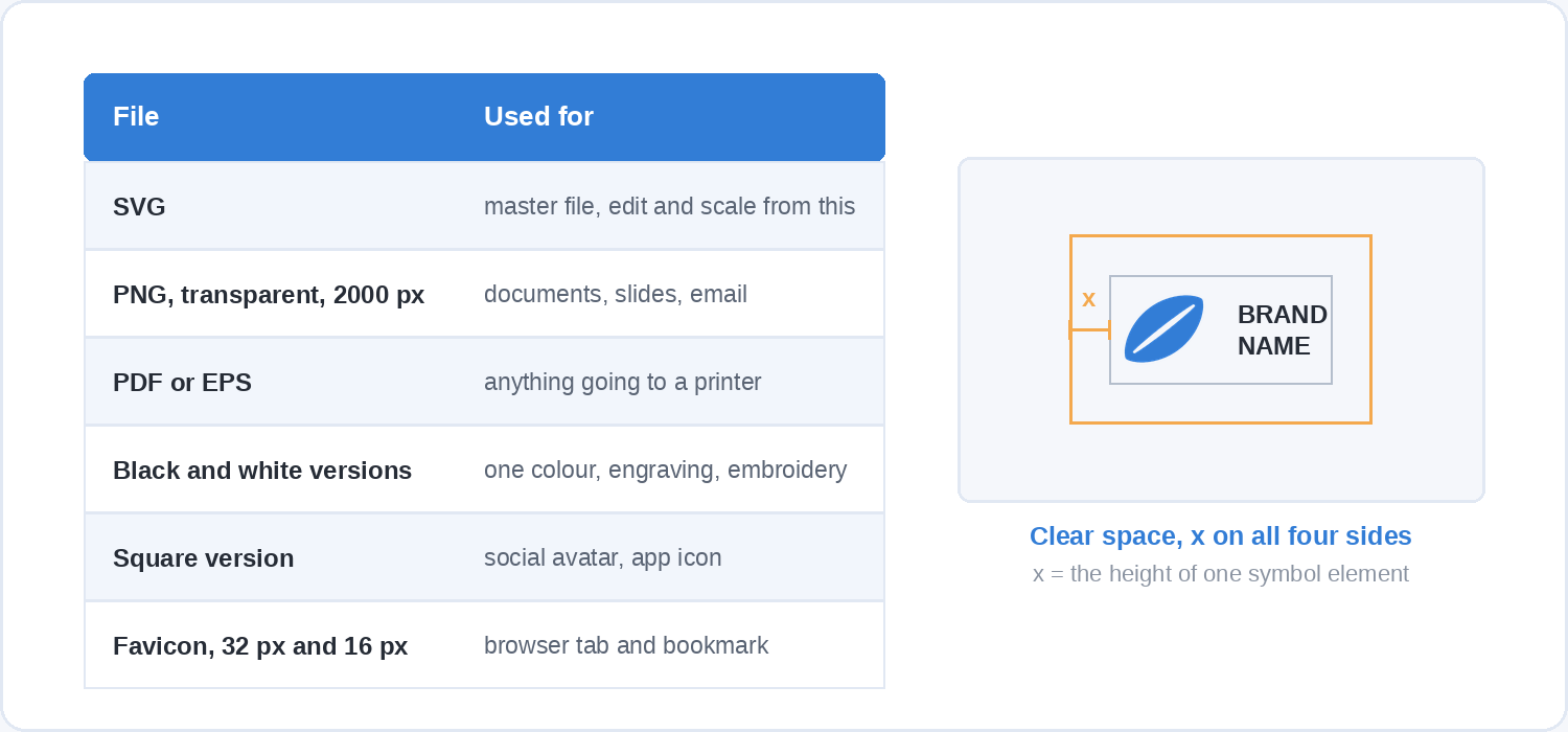
Hand over or keep a folder of six things, and you will never have to redraw the logo to answer a request.
Keep the SVG as the master, since it is the editable vector version everything else is generated from. Export a transparent PNG at a large size, around 2000 pixels wide, for anyone who needs to drop the logo into a document or a slide. Export a PDF or EPS for printers, who will ask for one. Save a black version and a white version, both flat, from the one-colour test. Make a square version for social avatars and app icons, usually the symbol on its own. And produce a favicon at 32 and 16 pixels, checked at actual size.
Write down two rules alongside them: a minimum size below which the logo must not be used, and a clear space rule that keeps other elements away from it, commonly expressed as the height of one letter or one element of the symbol. Those two lines are what stop a good logo being ruined by the people who use it later, including you.
Should you check whether the logo already exists?
Yes, and you can do a useful first pass for free. The World Intellectual Property Organization’s Global Brand Database is open to anyone, covers international trademarks under the Madrid System along with the collections of many national and regional offices, and searches by image similarity as well as by name.
Searching is not the same as clearing a mark, and the rules differ everywhere, so treat a clean search as a reason to continue rather than as an answer. If the logo will carry a real business, the step after a clean search is a trademark professional in the country you trade in.
Questions people ask before they start
How long does designing a logo take?
A simple wordmark for a small business is an afternoon of work once the name is settled. A combination mark that goes through sketching, three rounds of the tests and a proper export set is more like two to three days of actual work, usually spread across a week so you can look at it with fresh eyes.
Can I design a logo with no design experience?
For a small business, yes, provided you stay inside your ability. A carefully set wordmark made by a beginner beats an ambitious illustration made by a beginner, every time, because type is already well drawn before you touch it and a drawn symbol is not.
Are AI logo generators any good?
They are quick and they are useful for generating shapes to react to. Two limits are worth knowing before you rely on one. The output is often raster rather than editable vector, which leaves you unable to fix or resize the mark properly, and the same generator serves the same visual conventions to everyone who asks it for a logo in your sector, which works directly against being distinctive. Use one for ideas, then rebuild the idea yourself in vector.
What size should a logo be?
There is no single size, which is the reason for vector. Design it as an SVG, then export whatever a given use needs, and record a minimum size so nobody uses it smaller than it can stand.
Should the logo include a tagline?
Keep the tagline as a separate lockup rather than part of the main mark. Taglines change, they are unreadable at small sizes, and welding one to the symbol means redrawing the logo every time the copy is rewritten.
How many colours should a logo have?
One or two. Whatever you pick has to survive being reduced to black, so every colour in the mark is a decoration on top of a shape that already works.
Where to go next
Most people get through the thinking in this guide without much trouble and then stall at the making, because vector tools only get easier with practice. Soofos has 40+ free courses covering Photoshop, photography, marketing and more, and a free account is a no-cost way to get comfortable with design software before you decide to spend anything on it.